
IMPROVEMENT OF COMPOSITION DUE TO THE TONE CONTRAST
 Now a lot of discussions about composition tend to concentrate on such bases, usually third, leading lines, the use of color, etc. But not many people remember the tonal contrast. A real shame! But this is the very element that can really improve the whole composition.
What is tonal contrast?
This contrast is created by light and dark tones lying next to each other. Here is an example.
Improved composition due to tonal contrast
The tonal contrast in this photograph is created by the difference in brightness between the white flower and the dark green background.
In any photograph, a person’s gaze naturally immediately goes straight to the highlighted areas. The eye of the viewer is attracted by the lightest tones in the image, a flower, and then slowly moves through the rest of the photo, already picking up details. This sets a kind of visual dynamic between light and dark tones.
Here is another example of tonal contrast in action.
Here the tonal contrast is provided by the difference in brightness between the white parts of the waterfall and the clothes of the model, as well as the dark tones of water and stones.
Work in black and white
Tonal contrast is the basis of many successful black and white images. Indeed, if you need help to see the tones in your color photographs, the easiest way to do this is to open them in the photo editor and reduce the color saturation to zero. This is what happens with the two photos above, when we do so much simple manipulation, like transferring a photo to monochrome.
Tonal contrast is easier to see on black and white images, because there is no color on them that distracts your eye from the brightness values in the photo. You will also notice that the composition of these images is very simple – simplicity helps to improve the composition by eliminating distracting factors.
Let’s look at another example. The photo below was taken in an antique market in Shanghai. You can see on it two principles of composition in action.
Simplicity: the photographer approached to concentrate fully on the dominoes.
Tonal contrast: ivory dominoes are compensated by the dark tones of the box in which they are located.
And here is the unsaturated version. The tonal contrast in this image is even clearer.
There are a few points that I would like to note.
Tonal contrast is a great base for a successful black and white image. All unsaturated versions of the above photos work quite well. It doesn’t take a lot of work to turn them into amazing monochrome shots.
Images with strong tonal contrast usually work well in both black and white and color. An interesting exercise that you can try is to return to the photos you have already taken and choose those that have a tonal contrast. Then convert them to black and white. This way you can create some strong monochrome images.
The simplicity of your compositions helps to maximize the use of tonal contrast. If you include too many elements in the frame, the effect of tonal contrast will be reduced.
Finally, note that reducing color saturation to zero is usually not the best way to convert a color image to a monochrome. The goal in this case is to make the tones easier to recognize, eliminating distracting colors. Does this mean that each image requires tonal contrast to be successful? No, it is not. This is just one of many tools in your arsenal.
Learning to recognize and use tonal contrast helps you create stronger photos. For example, if you made a photo session with a model in a place with a dark background, you can ask her to wear something light to create a tonal contrast between the clothing and the background.
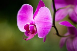
Lack of tonal contrast
There are times when the tonal contrast does not appear in the photograph, but the composition is still successful. View the snapshot below.
You may notice that there is not a lot of tonal contrast in this image. Nevertheless, the photo works, because the purple flower is nicely complemented by a green background. This is called color contrast and in this image more than compensates for the lack of tonal contrast.